The main reason why WordPress is the most popular way to build your website is that, besides website building tools, you have a plethora of additional plugins that will help you grow your website.
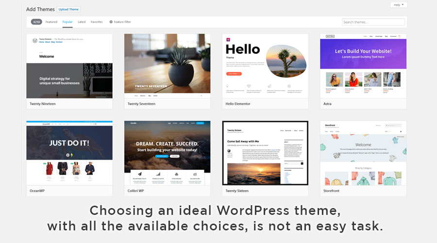
After you got yourself a domain and WordPress hosting it is time to choose a theme design. WordPress themes are thousands to choose from. But which one fits your needs best? And which is going to be the most appealing?
To be able to choose one that is best, we have to take a lot of specific factors like accessibility, page loading time, SEO … etc. which is too much for one article.

This time we would like to focus on which elements you should look for when finding a WordPress theme that makes your page super attractive, and we will discuss some of the elements you will need to consider so that you can create a loyal audience in turn.
Why WordPress theme design is important
There are millions of websites online, from lifestyle blogs to webshops, it is not easy choosing a theme design for your website.
Knowing they can easily click and continue to the next website makes every single visitor valuable, and your website design crucial in establishing that amazing first impression.
If for the first time people arrive at the site and it looks disorderly, boring, rough to look at, and they can’t see instantly why they should be interested … they are gone, and they will check out your rival’s websites.

Statistics show that your website has about three seconds to give the visitor a good or bad impression. If the look and feel of the website are unprofessional, people will get the feeling they are in the hands of an amateur. Website design can make or break the growth of your audience.
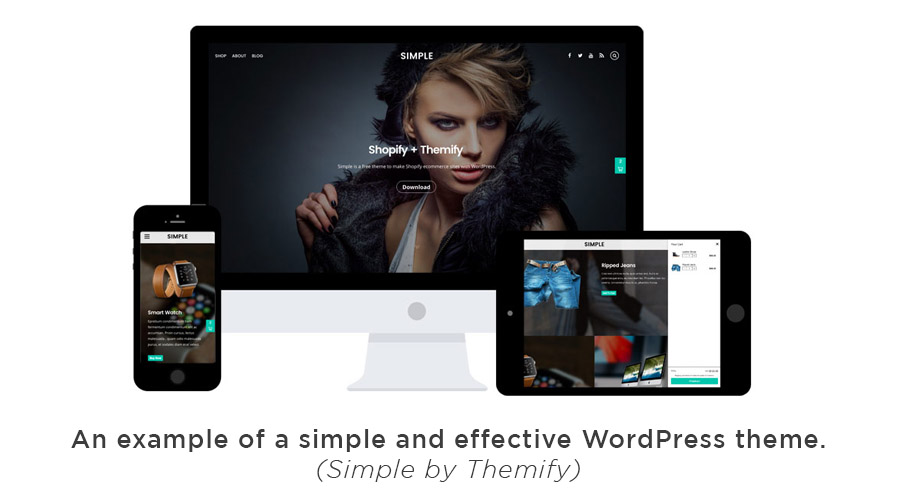
The value of simplicity
It may sound off, but a study conducted by Google has shown that website visitors are turned off by visual complexity. The areas where you must keep things nice and simple are:
- Homepage – make the page simple, with bold headings and punchy sentences that will draw the attention of the visitor.
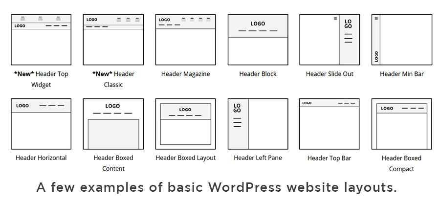
- Layout – It’s nice to think outside the box to describe a product or service, but when it comes to website layout, stick to familiar designs by checking out the layout of the authoritative website in your business niche.
- Sliders, Tabs and moving visual elements – can seem clever and modern but the fact is that users mostly don’t click on them. People tend to scan content, so make sure they don’t need to click around to find it.
- Limited choices are better – This applies to your website menu and your product or service offerings. Don’t display everything in one go. Create clear, helpful categories that target people’s needs. The more choices you give a visitor, the longer they’ll take to make a decision.
- Color design – If you have lots of clashing colors you’ll really put people off. The general rule of thumb is to have a palette of two main colors (not counting the black or dark grey of text). You want a balance between vibrancy and a feeling of lightness.
- Pictures, video and other media – are great tools for explanations, but do not overdo with them else you will be causing distraction instead of engagement.
These are the most important elements you should not overlook when choosing a WordPress theme.

Additional design tips
Before wrapping up the article, we would like to mention some additional good design tips that are more in the realm of common sense than WordPress as a topic:
- Text visibility and readability – If your site text is too thin, low-contrast, or in a hard-to-read font, the users are going to get tired real quick and click away. The same can be said for a big block of text. Instead, have the text in short paragraphs with subheadings that people can scan to find what’s important to them.
- Images with people – give your website a human side. Research by the Basecamp workflow software company demonstrated the strength of the photo to relate to your audience. People relate to people—it’s as simple as that. But the caveat is to avoid free stock images if possible.
- Click Buttons – A website can be much more effective with clear social media and CTA (Call to Action) buttons. Strategically placed CTAs are a big part of sales conversion. Ideally, you’ll want to test several variations over time to see what works best, like different colors, labels, and positioning.
Conclusion
You may be wondering by now, why have we not given you an example of the best WordPress theme? Well, the answer is because it depends on the website you are building.
This is the main reason why instead we focused on different aspects of the website that should be taken into account as elements of good website design.
Now that you understand the importance of good website design you will be able to make an educated choice for your WordPress theme shortlist, and in the end pick one that suits your project as the best.

